
Creating a Virtual Office Space for the COVID-19 Pandemic
Providing office workers with an office-like experience at home
Time & Team
March 2020 - May 2020 (9 Weeks)
5 UCSD Cognitive Science Undergraduates
My Role
UX/UI Designer
Researcher
Interviewer
Tools
Figma
Miro
Procreate
Adobe XD
Adobe Photoshop
Adobe Illustrator
The Problem
With the unexpected interference of the COVID-19 pandemic, countless office professionals were forced to work from home, a novel experience for many.
Upon gathering data, we discovered that this was problematic for many of these workers because, while they were able to skip daily commutes, there were multiple aspects of working in an office that they felt were missing in working from home.
In response, my team designed an application for office professionals named Knock, which emulates the feeling of working in an office via multiple mediums, including:
Statuses to indicate moment-to-moment availability of coworkers
Interactive tools for live meetings
Social gaming tools

Research
Interviews
My team conducted multiple user interviews to gain a stronger perspective in how newly at-home workers felt about having to work from home. Some questions we asked…
"What do you miss most about being physically present in the workplace?”
“Being able to ask questions when confused or in need of guidance”
“Knowing when people are too busy to disturb to ask a question”
“Having a close bond with the rest of my team”
“How has the structure of your workday changed since the pandemic began?”
“I feel things are less strict when it comes to logging onto work”
“I find myself getting up from my desk a lot more at home”
“Even though I’m not at work, I still find myself getting the same amount of work done in a given day”
“Have you designated a certain space in your home strictly for work?”
No, and I’ve noticed that I often get very easily distracted”
“Yes because otherwise my housemates intrude and make it difficult to focus”
“No because my apartment doesn’t have enough space”
Affinity Diagramming
Following our interviews, my team met digitally on Miro where we analyzed and extracted potentially-salient content from our individual interviews.
Once we finished brainstorming, we each swept through the sticky notes and grouped notes that followed similar themes.
Our goal was to discover recurring themes and how they made working from home more difficult for office workers.
Common Interview Themes
-
Benefits from Lack of Commute
Created less stress and more freedom
Allowed more time to complete actual work
-
Preference for All-In-One Tools
Often cited as the easiest and most enjoyable to use (i.e. Microsoft Teams)
-
Enjoyment of Social Gaming Tools
Allows for casual connections between coworkers
Overwhelming interest in interactive games
Personas
With our personas, we wanted to capture both workers who were mostly fond of and also averse to working from home. The goal for our design was to ably suit the needs of both by effectively bridging the gap between the two and retaining each of their advantages while minimizing the difficulties and hurdles the workers experienced.
Potential Design Solutions
Based on the problems and benefits that we identified from our research, my team ideated three main potential designs solutions to help fill a gap or expand on a benefit from working from home.
Virtual Office Space App
All-in-one social/professional platform that allows users to virtually "stop in" to one's "office" based on a worker's individual availability & mimics other aspects of working in an office such as interactive video meetings and a social breakroom.
Virtual Reality (VR) Office
A VR office environment in which workers are equipped with VR headsets and are in a 3D virtual reality office.
Focus App
An application that provides mental separation between work and free time by blocking distracting websites and uses productivity tools such as the pomodoro method to help maintain long-term focus.
Our Solution
Upon deliberation, my team decided to pursue the Virtual Office Space App for a few main reasons:
It addressed many of the main concerns we discovered from our research, for example:
All-in-one tool
Allows for the social gaming as an aspect of the platform
It is unique and exists in a gap in the market for tools that assist workers feel connected with one another.
Virtual Reality (VR) Office application, while ambitious, would be difficult to widely implement due to high cost of VR headsets and large learning curve.
Storyboarding
In order to see how our design could work in practice, my team storyboarded how our app (then titled “Quarantweens”) could assist workers in having more of a sense of connectedness with their work and with their coworkers away from the office.

Ideation
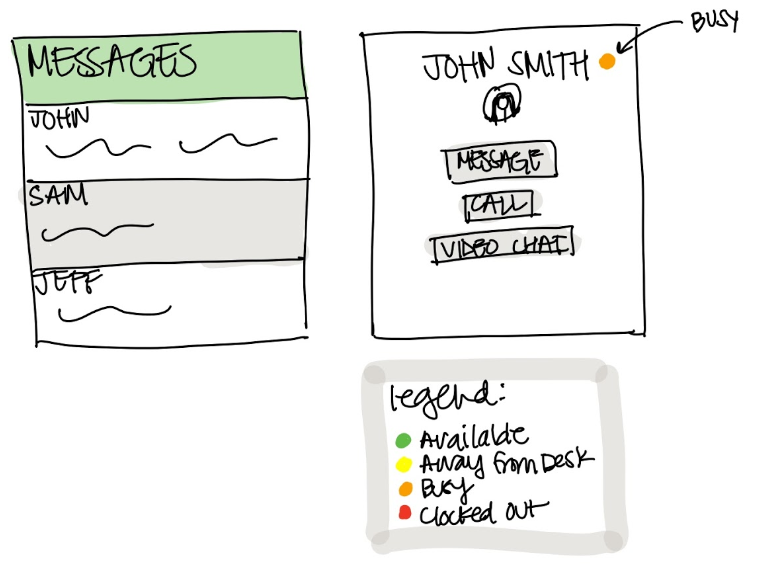
Availability Statuses
A common issue we discovered in our research was that workers who were new to working from home felt distant from their coworkers. This became a problem for workers for two main reasons:
It made it more difficult for workers to know when their coworkers were busy in case they had questions or needed professional correspondence.
It created a sense of social isolation for workers and made the workday feel less social.
In response to this, my team modified the common feature of Availability Statuses to help more closely mimic the office environment.
We created five types of statuses below, which work together to help remove a few degrees of social separation from the online environment while retaining enough personal privacy to help users remain focused.
First Hand-Drawn Wireframes
The first wireframe my team ideated. It consisted of the flow of what users would experience when initially opening our application.
In order, the flow consisted of:
The Landing Page (top left)
The Login Page (top right)
The Dashboard Page (middle left)
The home page where users can access different features of the application including:
The Personal Workspace Page
The Meeting Room
The Discussion Page
The Groups Page
The Sidebar View (middle right), which shows information at a glance without having to visit another page
The Personal Workspace Page (bottom left), which is customizable for each user to fit their own organizational style, similar to a real office space.
The Meeting Room Page (bottom right), which shows a list of both upcoming and in-progress meetings
The Team Page (top left), which shows the members of the team and shows the Availability Statuses of the team members.
The Meeting Room Page (top right), which was drawn to mimic actually being in a board room with a long table, seats and an interactive white board at the front that anyone in the meeting can enlarge and draw on with their cursor, as shown in the middle-left image
The Team Profiles Page (middle right), which shows a more detailed view of team members

Digital Wireframes
Our individual initial visions for what we wanted our further prototypes to potentially resemble.

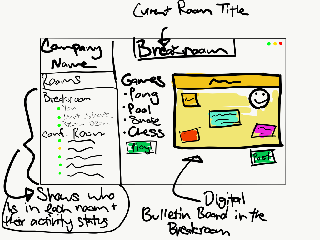
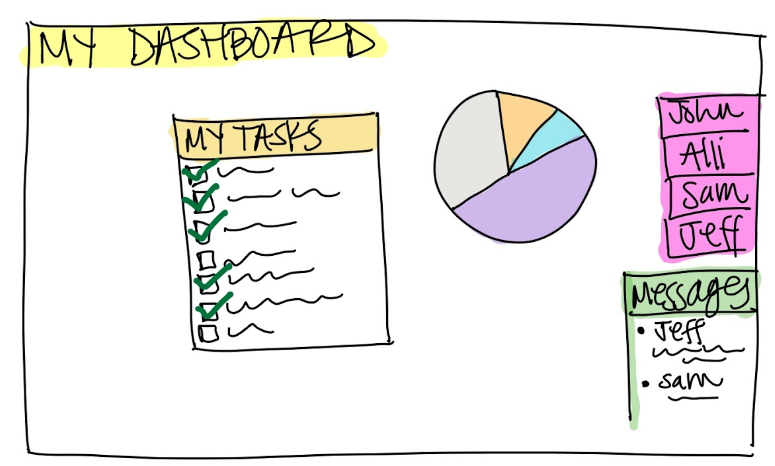
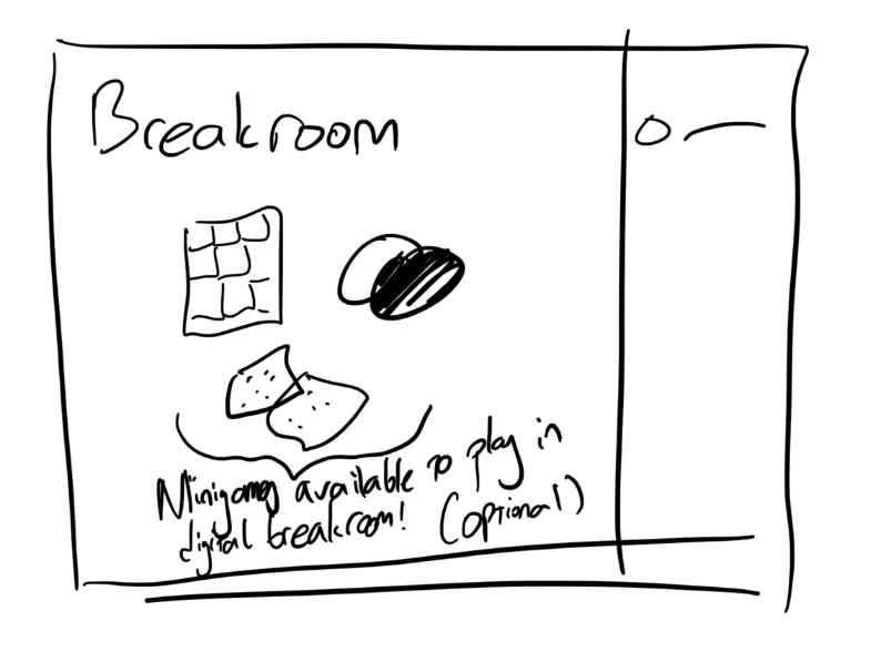
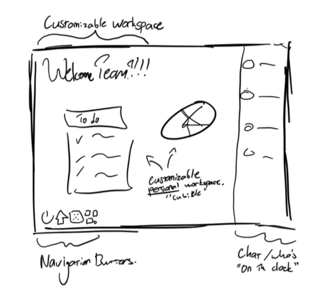
Second Digital Wireframes
Figma Wireframing
-
Conference Room Wireframe
Depicting different users in a meeting via Knock, where they are able to collaboratively draw on a white board to help convey ideas visually, emulating an actual conference room white board.
-
Dashboard Wireframe
Showing how an individual users’ customizable Dashboard could look like, including links to their most commonly-used features of the platform as well as reminders.
Prototype 1.0
-

'User Workspace' View
Workspace includes a variety of user-selected panels that can display a variety of information (Calendar, To-Do List, etc.), customizable Availability Status at the top, and 'Messages' panel which always remains on the left.
-

'People' View
A quick way for users to view a comprehensive list of their coworkers. This page also displays their Availability Statuses.
User Testing
Upon translating our Figma wireframe to a testable Adobe XD wireframe (Prototype 1.0), we surveyed a group of potential users to receive feedback and extracted a few key ideas that helped us understand that our design tried too hard to fit as much as possible in the window.
“It feels like there’s too much at once. It feels a bit cluttered to me.”
“Going from page-to-page doesn’t feel very intuitive. I’m not sure how to navigate it.”
“I’m not a big fan of the colors, in general, but especially of the statuses at the top.”
“‘Messages’ and ‘Design Team’ feel a bit crammed in on the left”
Prototype 2.0
In response to the user testing we conducted for our first prototype, we ended up stripping back in terms of color to focus on the design of the platform first, and we made conscious efforts to reduce clutter while still presenting a wealth of useful information to the users. Notable changes from the first prototype include:
Integration of the ‘Current Status’ and ‘Notification’ windows into one consolidated space on the right side of the screen to reduce the amount of clutter.
Removal of ‘Messages’ window from the right side of the screen in favor of menu navigation buttons to give users one-click access to any feature of the platform.
Change of color scheme from bright reds and oranges to a more grey/blue so it’s easier on the eyes of the users.

Final Design
Landing Page
Featuring a darker navy blue-center color theme, along with the Knock logo and a quick way to find your company and log into the platform.
User Flow
-

Login Page
Upon logging in, there is the ability to set statuses including a “Joinable” option, in which other users can seamlessly enter voice chat with coworker knowing they won’t be bothering them or intruding on their work.
-

Dashboard
Customizable dashboard that allows users to prioritize the most important features for them.
-

Company Homepage
Company-directed hub that succinctly showcases tools, important events and resources available to individual employees.
-

Collaborative Task View
Helps easily divide workload and eliminate overlap between teammates.
-

'Meetings' View
Overview of meeting rooms that mimic physical conference rooms, displaying active meetings, upcoming meetings, and people who are in open rooms willing to chat.
-

Inside a Conference Room
Users are able to express ideas through voice chat, text chat, and even through collaboratively drawing on a pop-up virtual whiteboard.
-

'People' View
Showcasing the people that work at the company and their individual Availability Statuses.
-

Receiving a 'Knock'
An out-of-the-way view (top-left) that occurs when a user ‘Knocks’ and joins you in a voice chat, also expandable to video chat and available to be joined by other employees.
-

'Community' View
Community page that acts as a forum-style posting space for employees as a way to share non work-related pictures and comments with colleagues, helping facilitate a friendly and social environment.
-

'Game Room' View
Example of an included trivia game, addressing desires for social gaming tools to help workers casually interact with one another.


