Redesigning Website for UC San Diego Outreach Program
Creating a more smooth & seamless web experience for parents & students of UCSD TRIO.
Background
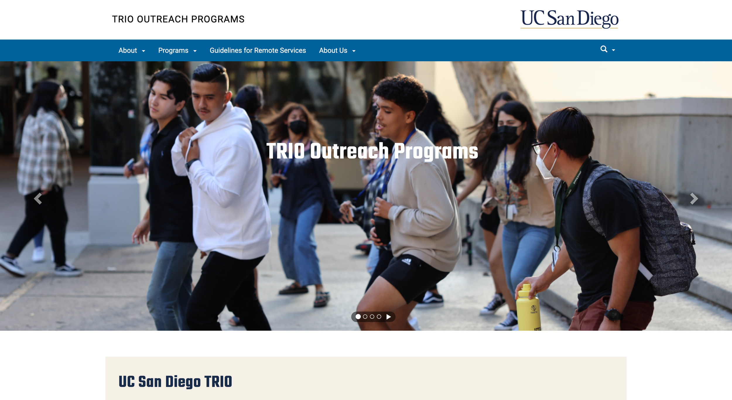
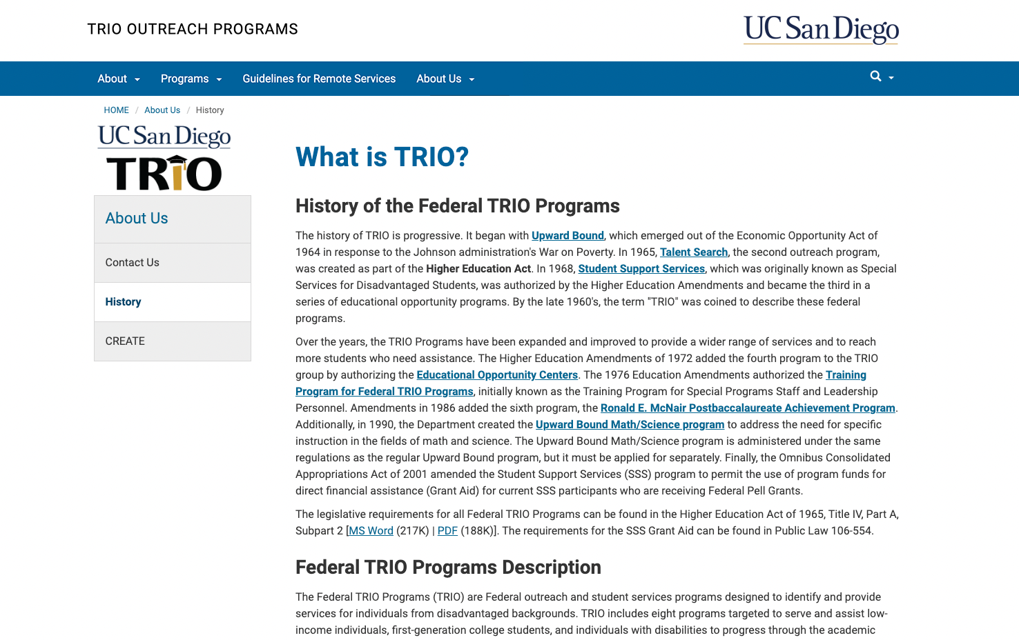
Since I started working for UCSD TRIO, an outreach program aimed at helping underprivileged high school students get into college, I noticed the program’s website had undergone very little maintenance in the several years its responsibilities were handed from person to person. This resulted in TRIO’s website being completely out of date, confusing to navigate and without a consistent design language.
I was tasked by my supervisor at UCSD TRIO to redesign our website with a cleaner & more modern approach. We conducted user testing on the site in its original state to identify the specific problem areas that users had. We used that data to design and create a much more seamless web experience for students to apply, and for parents and administrators interested in learning more about our programs.
Once we implemented our final designs, my team found that users were able to navigate through our new site and access important information 74% faster on average than on our old website.
Time
October 2023 - February 2024 (5 months)
My Role
Project Lead
UX Designer
Visual Designer
Researcher/Interviewer
Digital Tools
Figma
Miro
Wordpress
Adobe Photoshop & Illustrator
The Problem
Even as employees at UC San Diego TRIO with intimate knowledge of our operations, my colleagues and I unanimously agreed that our website was illogical and difficult to use. We knew that for newcomer students & parents especially, this would be a big barrier to learning more about our programs, seeing how to apply and finding who to contact for more information.
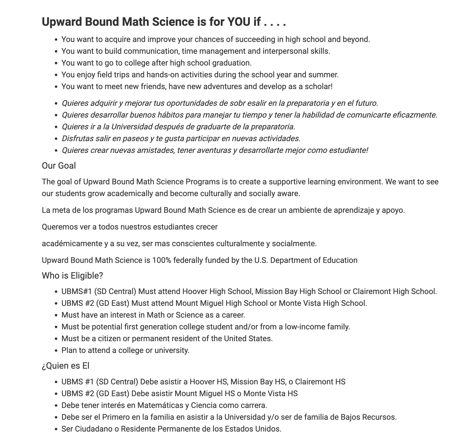
Since a large portion of our students come from primarily Spanish-speaking households, we recognized the significance of ensuring accessibility for these users. Previously, Spanish translations on the site were an afterthought, placed after the English content. This layout not only cluttered the site but also led to confusion for all users.
My team identified the 4 most important functions our website should serve, per stakeholder needs:
Teaching users more about what we do and about our programs.
Finding whether students are eligible for any of the programs.
Finding who to contact for more information about a specific program.
A place for students to apply for a TRIO program.
Upon inspection of our original website, we noticed that all four of these functions were buried under the website’s poor structure and lack of visual clarity.
Challenges
Prior to conducting our research & interviews, we identified potential challenges in creating a modern, clean and concise new website.
1. Visual Presentation
Learning how to design a modern & visually-engaging website; keeping it fun & stylish, yet professional.
2. Clear Information
Presenting the dense amount of info from our old site in an appealing way that’s easy to consume and doesn’t overwhelm the user.
3. Easy Navigation
4. Accessibility
Making the most important info easily accessible to the users (what TRIO is, how to apply & how to get in touch with us).
Ensuring the site is accessible for Spanish-speaking parents and students while avoiding text clutter.
Research
We began our research by defining what elements help create a modern & engaging website. We searched online and reconvened with our data to create an Affinity Diagram to find common themes and tie recurring pieces of data together.
User Personas
To gain a more practical perspective of how our site would be used, we created two user personas. These represent two of the most common types of users and predicts their personalities, needs and current frustrations.
Initial User Testing
In order to pinpoint the specific problem areas of our original website, my team used our personas as a blueprint and conducted user testing with 4 potential users:
Two young adults (to simulate prospective TRIO students) with relatively high computer literacy.
Two middle-aged adults (to simulate parents of prospective TRIO students) with medium to low computer literacy.
The four testers were given a brief background of the program and given their respective roles. They were then assigned a set of timed tasks to complete on a laptop computer to test the effectiveness of our original website in providing users the information we identified as the most important. Each test was followed by an interview to gauge user feedback.
From these preliminary tests, a few pieces of information became abundantly clear:
A vast majority of the difficulties expressed by testers in completing these tasks was trouble navigating.
All users had trouble navigating from page-to-page to find the information they were looking for.
All users had trouble finding eligibility and how to submit an application. Finding the application was the hardest task for users.
Excessive text (in combination with confusing navigation) was also a key hang-up preventing the testers from finding the important information they needed to complete these tasks.
We used this data as a basis to inform our designs and to create a new website from the ground up.
Solution
Since a main barrier to important information on our old site was difficulty navigating, we started by identifying which specific key pages would exist on our new site and the information they should contain. To simplify navigation and eliminate confusion, our solution was to direct traffic from the Home page to one of three pages depending on the type of visitor…
About Us
Giving all website visitors an overview of our programs, what we offer and the history of TRIO programs.
General Visitors
Initial structure for our new website’s pages.
Current TRIO Students/
Their Parents
Current Students
A frequently-updated page that shares new information and events relevant to TRIO students (college workshops, deadlines, scholarships, etc).
Prospective TRIO Students/
Their Parents
Future Students
To give prospective students an impression of what to expect from one of our programs and offer a place for them to apply to a TRIO program.
Our goal with this approach was to start users with a directory pointing them to information relevant to them. This greatly differed from our old site’s approach of providing a massive pool of information that relied on users being responsible for finding and parsing out information that’s relevant to them. This solution removes that extra work that previously fell on the shoulders of the users.
Once we had this idea for these pages loosely developed, we began to flesh out our initial structure of these pages further.
On our old site, user testers showed a split between wanting to navigate either through in-page links or from the menu bar. Because of this, we wanted to ensure that users could reach every page of the site from both in-page navigation and from the menu bar at the top of each page. This assures that users can find their destinations regardless of how they interact with the site.
Developing a Sitemap
Once we had a general idea of the types of pages we wanted on our site, we created a Sitemap to connect them and plan how navigating between them would look.
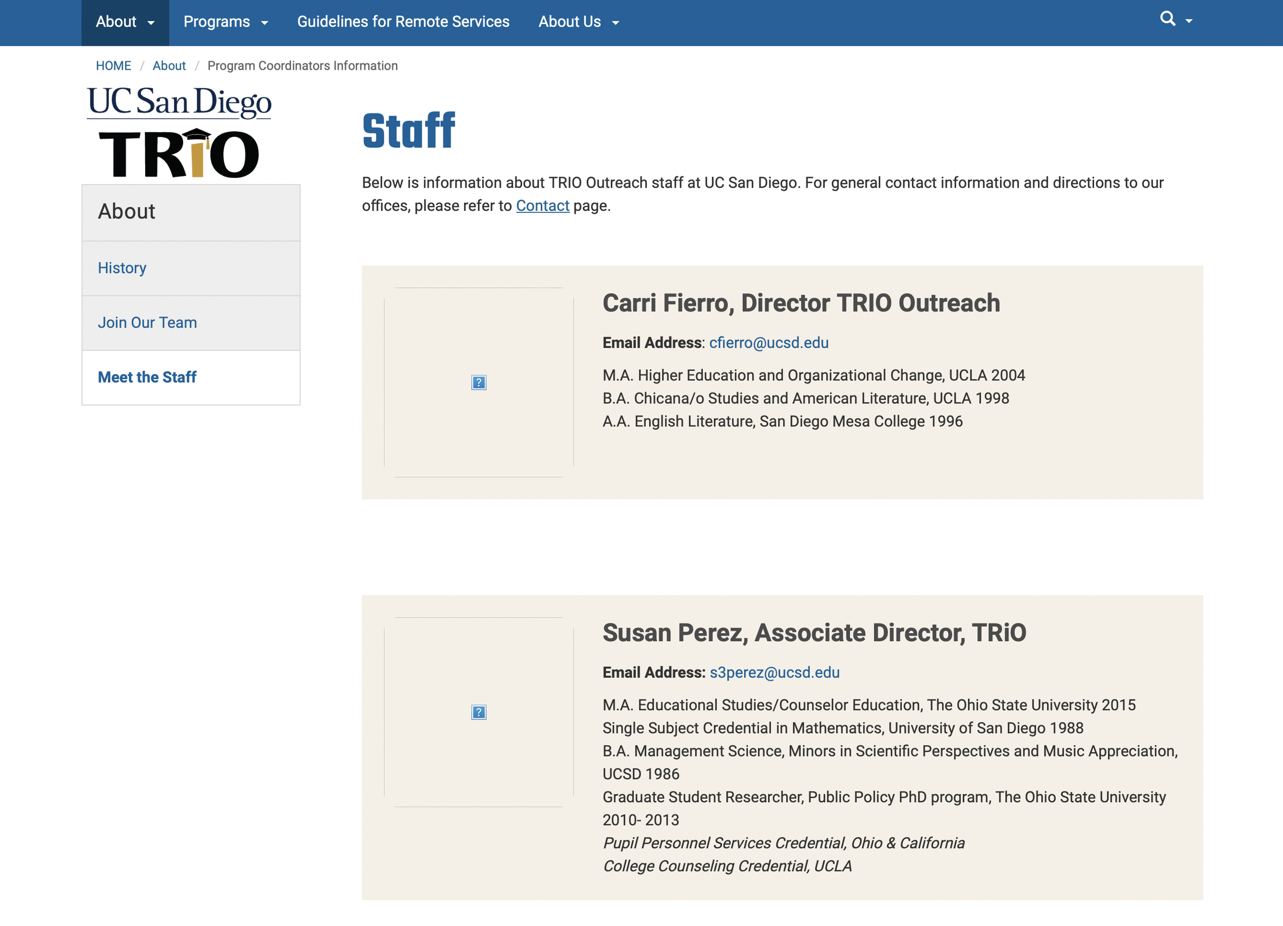
This process gave a glimpse of how a real prototype would function, immediately showing us that we were stacking too much information on the About page in our initial structuring. We remedied this by removing the “Meet TRIO” section and moving it to its own Staff page.
Since accessibility of important information was a main focus, we made it so the Home/Landing Page, users would have 1-click access to the seven most important pages on our site:
‘About TRIO,’ ‘Current Students’ & ‘Future Students’ Pages
The three ‘Program Pages’ (UBC, UBMS, Talent Search)
Staff Contact Page
Restructured menu bar.
Initial structure for our new menu bar.
We also restructured our menu bar design to be more balanced.
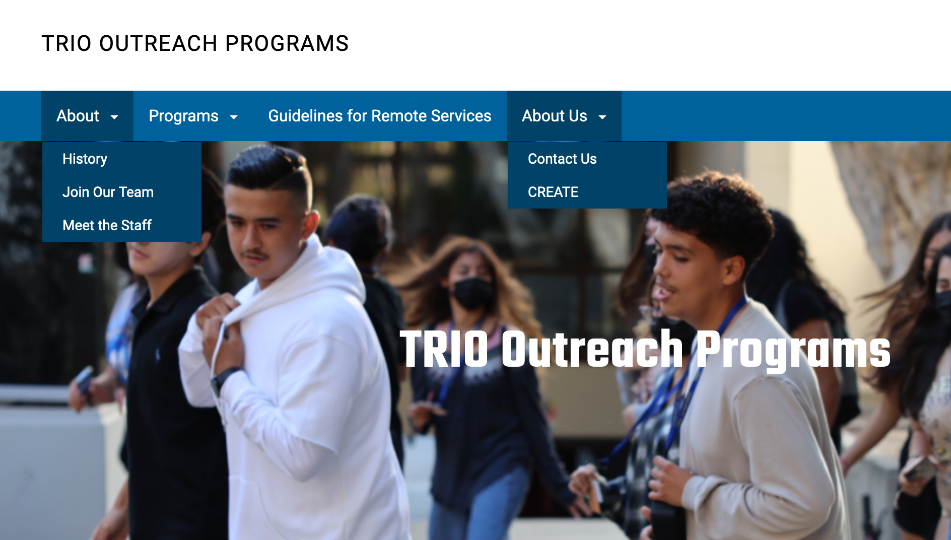
In our first ideation, the ‘About’ section had several dropdown menu options. We thought this could be confusing for users and we instead opted for spreading out these options across the menu bar, as some of them required dropdowns of their own.
Because finding where to apply was a big challenge for user testers, we also added an “Apply” button to the menu bar because we wanted it to always be visible and within close reach regardless of where users were on the site.
Overall, we felt that this structure would be more logical and immediate for users.
Home Page
Following our data, we decided it was important to have a full-page header for the home page. This would give users a warm, eye-catching welcome to the site instead of immediately presenting them with text.
Our research and testing data both showed the importance of spacing out information, allowing for smaller & more digestible bits of information while also maintaining a cleaner overall look.
While Version 1 looked uniform, Version 2 added different shading to indicate different sections of information, helping create a mental separation and reducing overall cognitive load.
First Iterations
Wireframe
Wireframe
Version 1
Version 2
Version 1
Version 2
‘About Us’ Page
Since the ‘About Us’ page’s purpose is to inform visitors about TRIO, its history and an overview of the programs, our goal was to inform with a good first impression.
We made Version 1 visually pop by including bright colors & an autoplay video so visitors would be encouraged to stay and read the info. We later decided these were too distracting and instead opened the page with a full-page header with a color gradient, both suggested by our web research.
To minimize visual confusion, Version 2 also removed Version 1’s two-column paragraphs and instead stacked text vertically for a more minimal and simple approach.
Wireframe
Version 1
Version 2
‘Future Students’ Page
Since this page’s aim is to have students sign up, our initial vision was to show off our programs & their services at the top of the page and then, once we hopefully intrigue the user, they would be met with a link to apply at the bottom of the screen. Version 1 featured a video of student testimonials, followed by fun pictures and descriptions of our services.
By Version 2, we realized that since user testers already had trouble finding their eligibility and where to apply, that we should instead prioritize that and integrate a step-by-step section that would walk users through the application process at the top of the page.
User Testing Version 2
Results
Universally our user testers showed a massive improvement in their ability to complete the 5 tasks this time around. The testers were able to find important data much more quickly & easily, asking far fewer questions than when completing these tasks on the old site.
Time to complete both Tasks 1 & 2, the most time-consuming for testers previously, was significantly less across the board. This and other reduced task times showed that we were moving in the right direction in our website’s structuring.
Version 2 user testing notes
While it was clear that this version of our site was an improvement over the original, there were still elements that needed to be addressed:
Finding eligibility was still challenging for users.
Language accessibility for Spanish-speakers still hadn’t been included.
While functional, the visual aesthetic of this website wasn’t fully developed.
Version 2 User Testing Data
Version 3
While two of our main challenges had been mostly addressed, the visual appearance of the website and the accessibility for Spanish speakers, and finding eligibility still needed work. These became the main focus for Version 3.
One way that we wanted to improve the appearance of our website was to make it more colorful & dynamic, since these are two key factors we learned contribute to a modern and engaging website. We started with the Menu Bar on the Home Page because it felt lackluster and didn’t stick to the clean and colorful design principles.
Version 3 Home Page Dynamic Menu Banner
We first reskinned the menu bar with a blue gradient and placed our logo instead of the long string of text at the top of the page. Once users enter the site, they would be greeted with a cycling banner that helps the site feel more dynamic and would give users an eye-catching idea of how we assist students in reaching their educational and personal goals.
Version 3 Home Page Full-Page Header
Since we still had not incorporated much UCSD imagery, we used that as a basis to create a more visually appealing full-page header section for the Home Page. We used layers of wave effects and a carousel of UCSD & TRIO-related images to help further give the website a feeling of movement and dynamism.
Version 3 Adding Interactivity & Dynamics
We wanted to give users little ways to be able to interact with the new website, encouraging them to be more engaged with it and with the information being presented to them.
In this section, the boxes describing each program spring to life and acts as a link to each of these individual program pages. They also help alleviate eligibility troubles since they each list the schools that apply for each program in a way that literally jumps out at the user.
To further clarify eligibility, we added an entire section dedicated to outlining eligibility for each program on the three Program pages.
In these sections, the two boxes that define each program fade in as the user scrolls. This sense of movement is meant to grab the attention of the user.
The portraits of each of the Program Coordinators also move upon hover, an added detail to give a further sense of movement.
Version 3 Spanish Accessibility
Redesigned “Our Programs” section on our Home page.
Re-worked Eligibility section on a Program page.
Because Spanish-speakers make up a sizable portion of the parents and students involved in the TRIO programs, accessibility for Spanish-speakers was crucial. We knew that our old website’s solution of doubling text in English & Spanish was off the table since it made finding info more difficult for both English and Spanish speakers.
Our solution was to instead include a language-switching option in the menu bar at the top of each page.
This allowed users the option to seamlessly switch back and forth between English and Spanish as needed. Further, we designed our site to automatically detect the language of the users’ browser and to follow that, so Spanish-speaking users aren’t required to switch to Spanish once they reach the site.
Final Design
Reflection
We re-tested users once the final version of the site was shipped. Testers showed a universal improvement in task times across the board; they completed the tasks 74% faster on average and expressed a greater sense of ease with navigating the site overall.
Our stakeholders were also pleased with the final product, specifically mentioning how they appreciated our attention to detail in reducing the cognitive load for users in comparison to the old site. We did this through simplifying the interface, chunking information, providing clear instructions, and keeping the design more consistent throughout.


