Website Redesign
~
Website Redesign ~
for
UC San Diego Outreach Program
Timeframe
October 2023 - February 2024
My Role
Project Lead
UX Designer
Visual Designer
Researcher/Interviewer
Digital Tools
Figma
Miro
Wordpress
Adobe Photoshop & Illustrator
Background
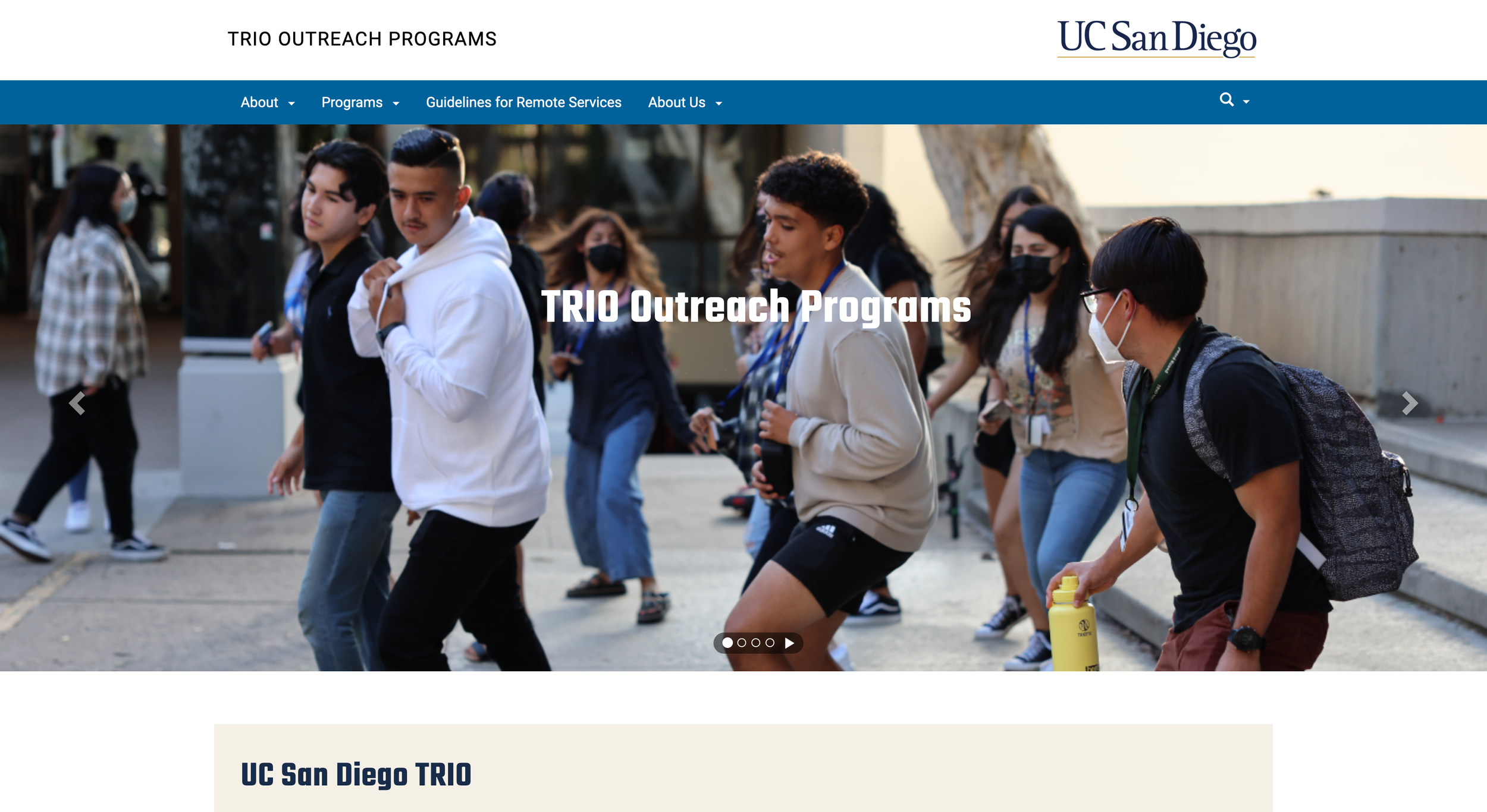
While employed by UCSD TRIO, an outreach program aimed at helping underprivileged high schoolers pursue higher education, my team revamped their outdated website to be cleaner, modern & user-friendly.
Through testing and redesign, we made it 74% faster for users to find important information.
The Problem 💭
UC San Diego TRIO needed their website to serve four essential purposes:
Informing visitors about its programs.
Determining whether students are eligible for any of the programs.
Finding who to contact for more information about a specific program.
A place for students to apply for a TRIO program.
Upon inspection, all four of these functions were buried under the website’s…
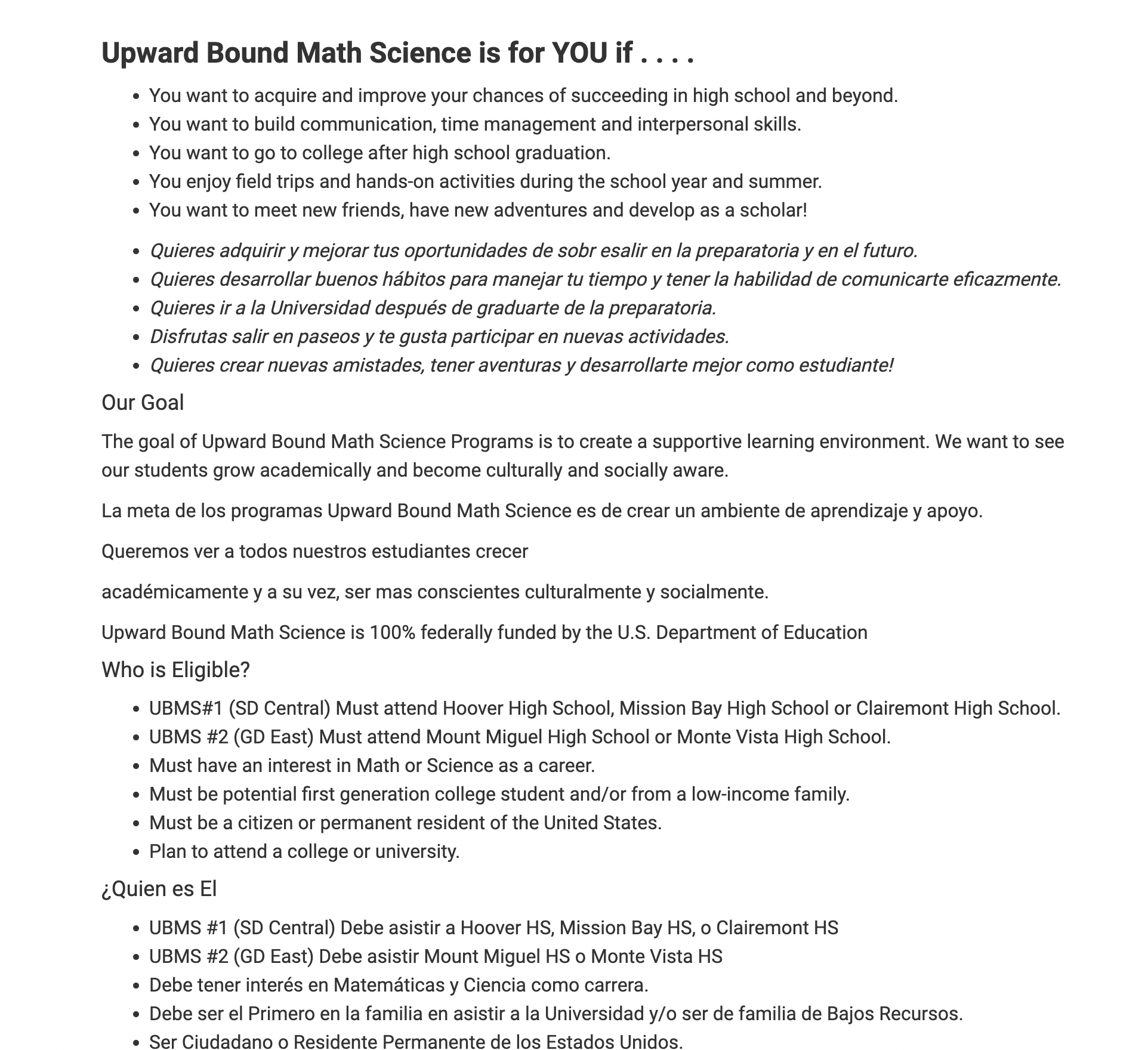
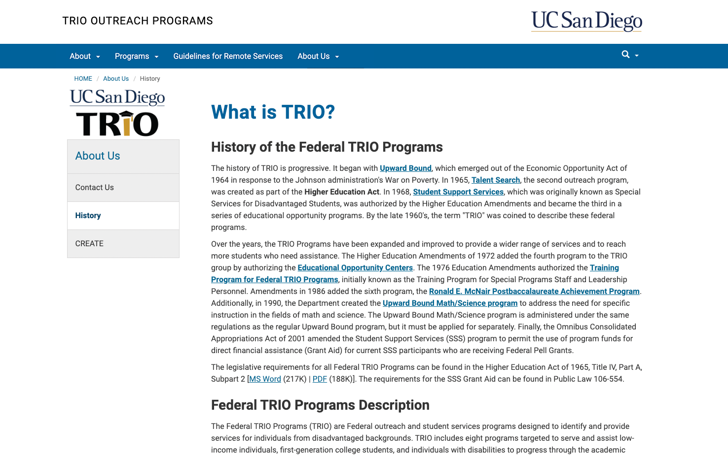
Outdated visual design
Poor structure
Lack of visual clarity
Challenges
Prior to conducting research & interviews, we identified the challenges of creating a modern, clean and concise new website.
1. Visual Presentation
Learning how to design a modern and visually-engaging website; keeping it fun & stylish, yet professional.
2. Clear Information
Presenting the dense amount of info from our old site in an appealing way that’s easy to consume and reduces cognitive load.
3. Easy Navigation
4. Accessibility
Making the most important info easily accessible to the users (what TRIO is, how to apply & how to get in touch with us).
Ensuring the site is accessible for Spanish-speaking parents and students while avoiding text clutter.
Research
We began with internet research to determine what elements to incorporate in a modern, clean and dynamic site.
Using user personas as a guide, 4 user testers were recruited to test essential functions and then interviewed. By affinity diagramming the data, we identified user needs, wants, and areas where the old site didn't meet expectations.
Since confusing navigation was clearly the biggest user hindrance, a site map followed to blueprint a neater site architecture, aiming to minimize user confusion.
Several wireframes were developed, each receiving rounds of user testing. Continuous user feedback and stakeholder needs helped shape each developing iteration.
Research overview. Link to full research.
Take a closer look…
Iterations
Version 1
Low fidelity iteration of new site; prioritized…
Site layout.
How info would be presented.
Rewriting old & outdated copy.
Finding colors, images, and videos that would accurately represent the programs.
Integrating feedback from old website testing.
Beginning to experiment with visual styles to see what would stick, but not a priority at this stage.
Click to expand.
Home
About
Future Students
Click to expand.
About
Click to expand.
Home
Home
About
Future Students
Future Students
Version 2
Mid-fidelity, first version of new site that was user testable.
Starting to find visual style & leaning into it.
Cleaning up visuals to be less distracting.
Dividing text into small pieces & distinct sections to be more digestible.
Making info layout uniform across each page.
Down the middle so users’ eyes don’t have to move around pages to find info.
Version 3
(final)
Fully-fleshed out visuals.
Integrated data and user feedback of V2.
Made difficult tasks (finding student eligibility, finding how to sign up) much easier for users.
74% faster for users to complete given tasks than on old website.
Redesigning Wayfinding
Landing on old site, users were presented with dense info but not given a direction to go.
All testers expressed feeling directionless, leading them to click on links and pages at random to navigate.
For TRIO newcomers especially, we knew this would be a massive barrier.
Home Page Directory
Identified the most accessed & important info, created a directory that leads users to their relevant info depending on type of user.
General Visitors
Current TRIO Students/Their Parents
Prospective TRIO Students/Their Parents
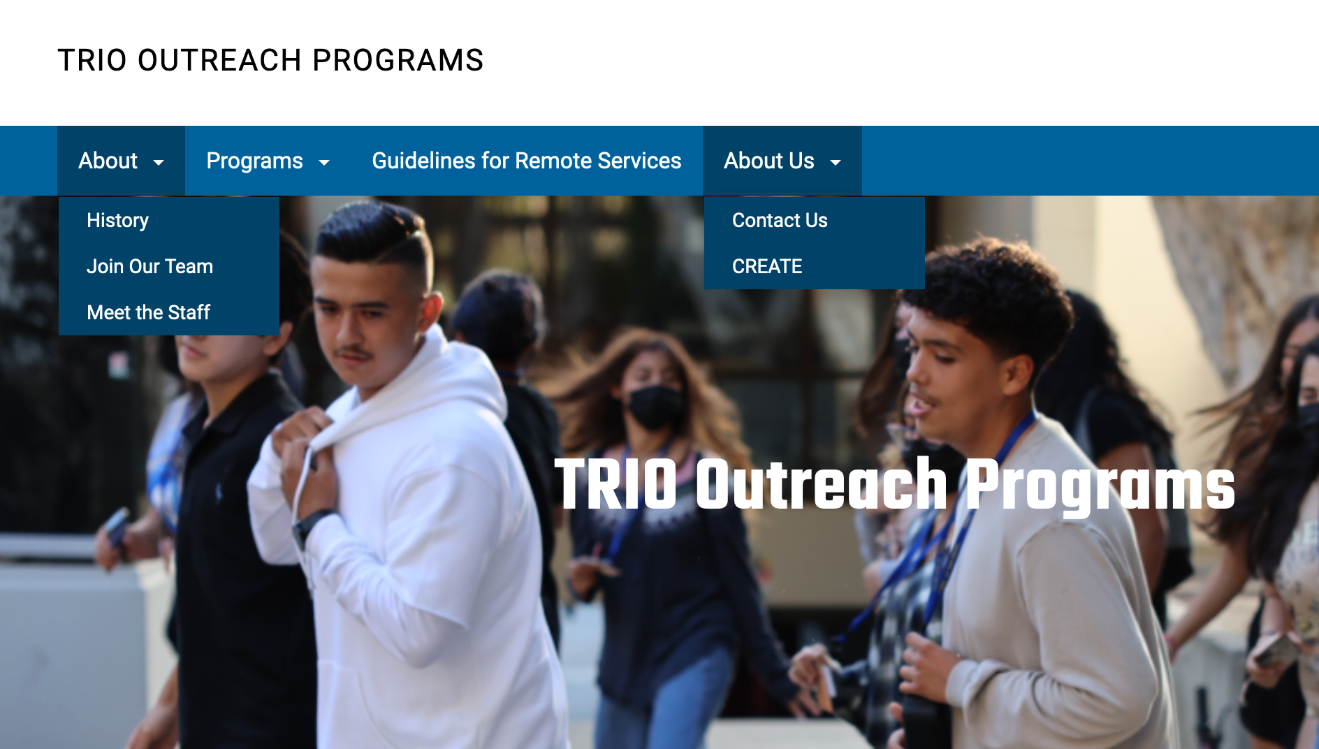
Counterintuitive Menu Bar
Solution
‘About
UCSD TRIO’
Overview of TRIO programs.
Services TRIO offers.
History of TRIO programs.
General Visitors
Current TRIO Students/
Their Parents
‘Current Students’
Frequently updated.
Relevant news for TRIO students (workshops, deadlines, scholarships, etc).
Prospective TRIO Students/
Their Parents
‘Future Students’
Offers students & parents an overview of UCSD TRIO.
Provides a place for students to apply.
Certain important pages extremely difficult to find.
Hidden in in-page links.
Some buried within paragraph text hyperlinks.
Logical Restructure
Original
Version 1
Version 2
Final
Organized by what felt most intuitive for users.
Multiple routes to any page, clearly displayed on every page.
One-click access to most important pages directly from Home page:
‘About TRIO,’ ‘Current’ & ‘Future Students.’
3 Program Pages (UBC, UBMS, TS).
Staff Contact Page.
Solution
Problem 3
Had multiple About sections, confusing users.
Lacked many options, forcing users to use in-page links to find certain pages.
Users showed split; half preferred the menu bar while the other preferred in-page navigation.
Old site’s structure had heavy bias for in-page navigation, slowing menu users.
New Menu Bar
Access to every page on the site at all times.
Follows users as they scroll down each page, assuring quick access to any other page.
Large yellow ‘Apply’ button, since finding the application previously was a huge challenge for testers.
Solution
Poor Site Structure
Problem 2
Users Getting Lost
Problem 1
Visual Design
We wanted to make our new site more colorful & dynamic, two factors that contribute to a modern and engaging website. We started with the Menu Bar on the Home Page because it felt lackluster and didn’t stick to the clean and colorful design principles.
Version 3 Dynamic Home Menu Banner
Version 3 Home Page Full-Page Header
To add a more eye-catching element to our home page, we added a cycling banner which adds a dynamic element and gives users a quick idea of how TRIO assists students. We also reskinned the menu bar with a blue gradient and added the TRIO logo.
Since we still had not incorporated much UCSD imagery, we used that as a basis to create a more visually appealing full-page header section for the Home Page. We used layers of wave effects and a carousel of UCSD & TRIO-related images to help further give the website a feeling of movement and dynamism.
Version 3 Adding Interactivity & Dynamics
We wanted to give users little ways to be able to interact with the new website, encouraging them to be more engaged with it and with the information being presented to them.
In this section, the boxes describing each program spring to life and acts as a link to each of these individual program pages. They also help alleviate eligibility troubles since they each list the schools that apply for each program in a way that literally jumps out at the user.
To further clarify eligibility, we added an entire section dedicated to outlining eligibility for each program on the three Program pages.
In these sections, the two boxes that define each program fade in as the user scrolls. This sense of movement is meant to grab the attention of the user.
The portraits of each of the Program Coordinators also move upon hover, an added detail to give a further sense of movement.
Redesigned “Our Programs” section on our Home page.
Re-worked Eligibility section on a Program page.
Accessibility
Because Spanish-speakers make up a sizable portion of the parents and students involved in the TRIO programs, accessibility for Spanish-speakers was crucial. We knew that our old website’s solution of doubling text in English & Spanish was off the table since it made finding info more difficult for both English and Spanish speakers.
Our solution was to instead include a language-switching option in the menu bar at the top of each page.
This allowed users the option to seamlessly switch back and forth between English and Spanish as needed. Further, we designed our site to automatically detect the language of the users’ browser and to follow that, so Spanish-speaking users aren’t required to switch to Spanish once they reach the site.
Final Design
Impact
We re-tested users once the final version of the site was shipped. Testers showed a universal improvement in task times across the board, completing the tasks 74% faster on average and expressing a greater sense of ease with navigating the site overall.
Stakeholders were pleased with the final product, appreciating our attention to detail in reducing the cognitive load for users. We did this through simplifying the interface, chunking information, providing clear instructions, and keeping the design more consistent throughout.

